Benoît Cannaferina , graphic designer from Bordeaux , is responsible for making the design of Château la Levrette. He has a realistic knowledge of the wine market , in Bordeaux but also in the rest of the world. That is the reason why Laetitia and Arthur Mauriac decided to work with him in order to garantee the good reputation of their wines .
The design of the Château has a doble meaning
La Levrette , is the female of the greyhound, it is chosen for the values it conveys : nobleness , faithfullness , femininity , fineness and elegance . This name has the advantage to suggest different values. Everything starts from here : from the ambiguity, in the doble meaning of the name.
A Challenge ! To build up a strong relevant image . To make a difference among the common classic labels of Bordeaux, simple, standardised, and show the high quality of the wines and the expertise of Château la Levrette.
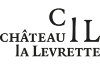
The logo of the Château follows the same idea of the label : doble meaning ! From this, everything follows. The monogram is created from the logo . It is based on the initials, the « C » for Château, the « l » for la, the « L » for Levrette, it all makes sense. The doble meaning of this monogram goes without saying. It’s up to you to find out what hides behind it !
The logo is cut so every label is different according to the colour of the wine . This highlights the wine it contains. On the website, only the pictures and the wines are coloured so they are naturally highlighted .
The design is full of contrasts : black and white, mat and bright, between full and empty, between tradition and modernity , between impact and fineness.. To follow the idea of contrasts, the design keeps a classic structure in a refined modernity .
